Amstha: A Gothic Blackletter Font That Anchors Your Campaign Voice
It was 3:47 p.m. on launch day — and I was squinting at a YouTube thumbnail on my phone. The background was moody, the contrast tight, but the headline felt… soft. Too polite. Too generic. We’d spent hours crafting the hook, selecting the image, dialing in the color grade — yet the text just floated, not landed. That’s when I swapped in Amstha.
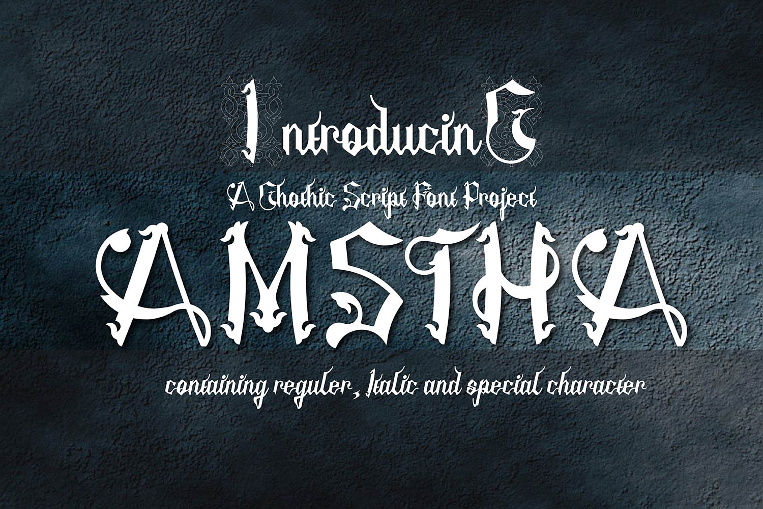
Instantly, the message rooted itself. Not with volume, but with presence. Amstha is a gothic blackletter font with intentional texture — torn edges, subtle ink bleed, sharp serifs that bite without aggression. It doesn’t shout; it *declares*. And in fast-scrolling feeds or thumbnail-sized previews, that declaration cuts through noise like a well-placed pause in a spoken sentence.
I used Amstha for the headline “NOCTURNE DROP” — three words, all caps, over a charcoal gradient. No extra effects. Just Amstha, set at 48pt, tracking tightened by 20. On mobile, it held weight. On desktop, it scaled with gravitas. That’s the quiet power of a thoughtfully chosen display font: it makes your intent legible before your audience even reads the words.
Amstha isn’t built for paragraphs. It’s built for moments — the first 0.8 seconds of visual contact. That’s why it shines across campaign touchpoints where impact precedes explanation: Instagram Reels covers, Pinterest pin titles, email banner headers, limited-edition shop banners, webinar promo graphics, and even short-form ad copy overlays. In each case, it serves as a stylistic anchor — a consistent tonal signature across platforms without needing logos or filters to reinforce mood.
Here’s what works — and what doesn’t:
- Best for: Short headlines (under 5 words), campaign labels (“FALL DARK MODE”, “FINAL ACT SALE”), quote graphics, logo-style wordmarks, and decorative titles in editorial or packaging design.
- Avoid for: Body copy, long captions, accessibility-critical CTAs (like “Add to Cart” buttons), or any text smaller than 24pt on light backgrounds — its texture reduces micro-legibility there.
- Mobile tip: Always test Amstha at 75% size on actual devices. It holds up best on dark or mid-tone backgrounds — the contrast lifts the torn edges, making them read as intentional character, not distortion.
Pairing Amstha is where strategy meets instinct. I almost always pair it with a clean, neutral sans serif — think Inter, Manrope, or even system fonts like San Francisco or Segoe UI. Why? Because Amstha carries the personality; the sans carries the clarity. In a recent Instagram carousel for a small-batch candle brand, we used Amstha for slide titles (“EMBER SERIES”, “SMOKE & SAGE”) and Inter for product descriptions, ingredient lists, and CTAs. The contrast wasn’t jarring — it was choreographed. One voice sets the scene; the other delivers the details.
You can also layer it subtly with a restrained serif for luxury-leaning campaigns (e.g., Amstha + Playfair Display) or a delicate script for contrast in editorial layouts — but only if the script is minimal and highly legible at small sizes. Never pair Amstha with another blackletter or heavy display font. It’s not about stacking drama — it’s about giving your message hierarchy, breathing room, and tonal precision.
Before dropping Amstha into client work or digital ads, I check three things: file formats (OTF and WOFF2 are non-negotiable for web use), included alternates (Amstha has smart ligatures and stylistic sets that add nuance to repeated letters), and commercial licensing. Yes — it’s a premium font, and yes, that matters. Using unlicensed type in paid ads or branded merchandise isn’t just risky; it dilutes trust. A licensed Blackletter font like Amstha comes with clear usage rights for social templates, email banners, Shopify themes, and even merch mockups — so you’re building assets, not liabilities.
We also tested Amstha across platforms with real content cadences. For a 7-day Instagram series teasing a new audio course, we used it consistently for daily post titles (“LESSON I: THE SILENCE BEFORE SOUND”) while keeping body text in a readable sans. Followers didn’t comment on the font — but they did say the series “felt cohesive,” “had weight,” and “didn’t blend in.” That’s the goal: typography that supports recognition without demanding attention.
And here’s something practical most guides skip: Amstha works best when treated like a design asset, not just text. I export key headlines as vector outlines for static assets (Pinterest pins, email headers), but keep live text layers for editable templates (Canva social kits, Figma landing page systems). That way, localization or last-minute tweaks stay agile — without sacrificing the font’s integrity.
It’s easy to chase trends — ultra-thin fonts, chaotic variable axes, hyper-modern glitch styles. But Amstha reminds me that clarity isn’t about simplicity alone. It’s about alignment: between message and mood, platform and proportion, brand voice and visual rhythm. When your campaign lives in dark-themed aesthetics, alternative culture spaces, or storytelling-driven niches, Amstha doesn’t just fit — it focuses.
So next time you’re tweaking that thumbnail, adjusting the banner spacing, or prepping a week of posts — don’t just ask, “Does this look good?” Ask, “Does this sound like us — before a single word is read?” That’s where Amstha earns its place: not as decoration, but as intention made visible.